How Arabic Typography Influences UX (Design+Code workshop)
Back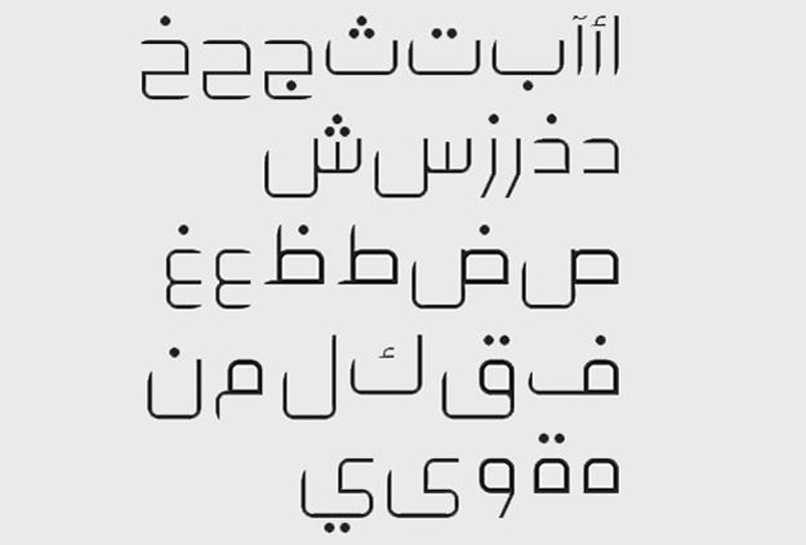
Share this article
','','https://www.arabnet.me/ContentFiles/2074Image.jpg?');)
','','https://www.arabnet.me/ContentFiles/2074Image.jpg?');)
','','https://www.arabnet.me/ContentFiles/2074Image.jpg?');)
“The role of typography can be very effective in enhancing UX, UI layout, hierarchy, and alignment of Arabic websites and apps.” said Rafiq El Mansy, lecturer at American University in Cairo, as well as design manager and author.
El Mansy introduced the workshop with some statistics from Arab Web Days:
- 413 million Arabic users will be online in this current year, with Arabic content making up just 3% of all online content worldwide.
- Internet penetration in the Middle East has reached an internet penetration of 40%, with 87% of those users accessing the internet from home.
We covered the user interface and user experience workshop yesterday, which is a good introduction for making design more user-friendly. This workshop however discusses how Arabic typography can impact everything from user interaction, to usability, content strategy, and visual design. Bad design means a bad user experience. We know we shouldn’t judge a book by its cover, but our natural impulse is to do that unconsciously, so it is better to have them work for us.
Visuals, attention to detail, and a consistent design are significantly important. Building a design shouldn’t be limited to drawing on your sketchbook, you have to imagine your user time and time again until you figure out what they’re like and adjust the website accordingly. For example: “Micheal” is a busy startup entrepreneur who would like to visit the website to read a specific category of news, he’s about 45. Now how do we reach him?
Hierarchy and RTL alignment
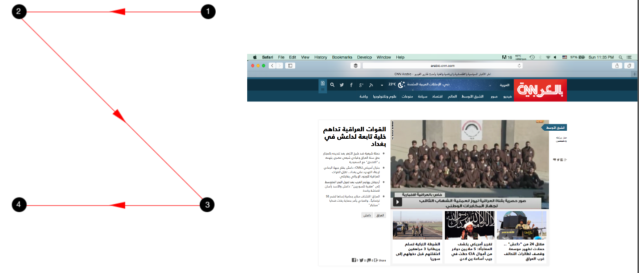
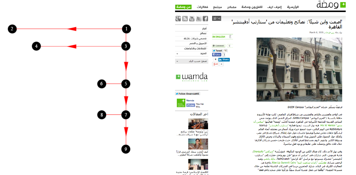
The above photos show how the eyes follow a specific flow of information; these patterns are great for simple designs that focus on a few key to pop them out for the visitor to get inside the flow of a home page or article. There is no excuse for new websites these days, they must make it easy for users to find the information they are looking for, and to bait users to click through and read.
How BBC Uses Principles of Typography to their Benefit
The BBC World Service website offers news in 27 different languages using 9 different scripts, you would think that they translate all their stories to the languages directly, but instead Editorial offers tailored content for each target market to maximize their performance on all ends. The language sites share the same set of design patterns, visitor flow principles and page layout methods as the BBC News site in English, yet adjust details to meet different audience expectations and the editorial offer of each site. Sometimes minor changes like highlighting letters in a certain way can make the text more readable in that language, these almost unnoticeable changes effect the overall experience of the website.
Default Arabic Fonts
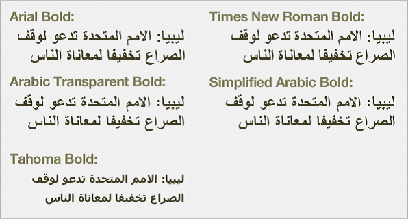
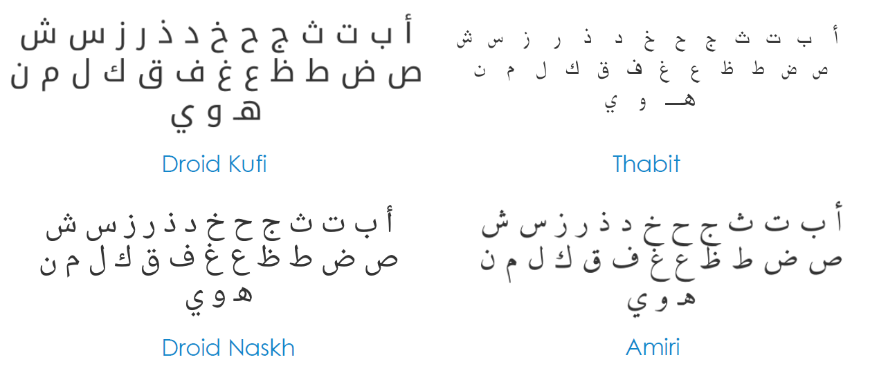
The problem is that web default Arabic fonts are much more peculiar than Latin. There are only 5 available fonts that support Arabic, and 4 of them have the same set of glyphs and Arabic character shape.
Thus, he advised the audience to go to Google Fonts and download Arabic standard fonts, install them on the computer, download the exercise Photoshop PSD document, extract the zip file, open it in Photoshop, and then finally to redesign the current layout to meet with the Arabic UX guidelines.
Redesign the current layout to meet with the Arabic UX guidelines. You can see all sorts of fonts, use them in applications, take them to Photoshop or Illustrator, or embed the font inside a website’s code.
Latest Business
Intelligence Report